
Options
Project card text contrast options
Ways to break up the writing in the project cards — faded washes behind words and tone-on-tone colour shifts. Shown on the Hamilton St card; hover each one to check it still feels right. Numbered as shown.
Option 01
Current baseline
Exactly as the live Work page renders today — no washes, default colours.
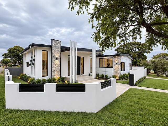
01
Full Rebuild & Extension
Family Home, Stripped Back and Rebuilt with an Extension
Hamilton St, South Wentworthville
View project
Option 02
Stone wash behind title
A soft stone band fades behind the whole title line.
02
Full Rebuild & Extension
Family Home, Stripped Back and Rebuilt with an Extension
Hamilton St, South Wentworthville
View project
Option 03
Two-tone title
The lead phrase stays ink; the rest of the title steps down to soft ink.
03
Full Rebuild & Extension
Family Home, Stripped Back and Rebuilt with an Extension
Hamilton St, South Wentworthville
View project
Option 04
Wash behind title, softened support
Stone band behind the title, with the blurb and area lightened so the title carries the card.
04
Full Rebuild & Extension
Family Home, Stripped Back and Rebuilt with an Extension
Hamilton St, South Wentworthville
View project
Option 05
Washed type label
The small type label sits in a faded pill instead of bare text.
05
Full Rebuild & Extension
Family Home, Stripped Back and Rebuilt with an Extension
Hamilton St, South Wentworthville
View project